Notes from #SheilaShed – My top small space design tips!
So where do I start…
In 2020, just before the pandemic hit, we purchased a Victorian Coach House in need of some serious love (understatement of the century LOL). It soon became clear, that simply getting through the conservation area planning process, during a global pandemic, was going to take a very very very very VERY long time! And that, by the time we were eventually ready to start building, the house would be uninhabitable anyway with most of it needing to be demolished and the entire roof structure needing to come off.
And so...
While dealing with two small children at home, surrounded by our rather dusty dilapidated house, we made the decision to build a tiny house at the bottom of our garden! The plan was for the tiny house (affectionately nicknamed #SheilaShed) to house us for the estimated 18-24+ months build duration, and then eventually become kick ass guest accommodation, my creative home office hub, and an AirBNB.
This was without a doubt an investment, but one that we knew would pay off in the long run as the tiny house would stay standing forever, add value to our home, house our friends and family, and ultimately pay for itself in a matter of years via photoshoots, campaigns and rental income.
We had 450sqft to work with, squeezing the tiny house into a rather sad section of our unusual banana shaped garden plot. 450sqft for a family of four to eat, sleep, relax, play, work, sh%t, shower and shave in, was a rather tall order LOL, but I was up for the challenge, and truth be told, head scratching small space design is my absolute fave pass time!
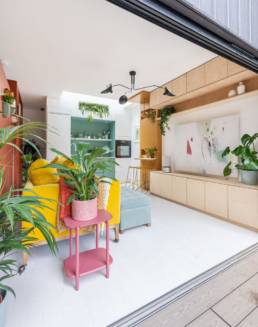
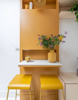
When it comes to small space design, you have to make every last inch count, it’s all about creating the perfect balance between form and function, and I am not one to compromise on either! As a colour lover and a Mum of two young boys, I also wanted to take the opportunity to demonstrate that you can totally use colour in small spaces too! Infact, I believe my use of colour in our tiny home is actually a big contributing factor to the overall success of the final design.
Taking the internal ceiling height to 3 metres required full planning permission, but as we had to apply anyhow (see this blog for more information on planning a garden studio), this was a no brainer. Extra ceiling height literally creates an optical illusion when it comes to space (especially if you draw attention to it by adding things that will draw the eye upwards as we have done)
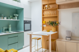
So the extra 50cm ceiling height made our modest studio feel generous, and allowed us to build heaps of storage using all those vertical inches to our best advantage.
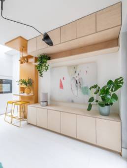
My top small living design features
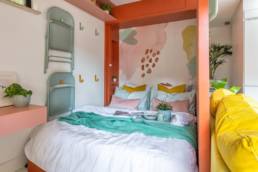
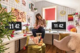
A DIY Murphy bed: It became clear very quickly that we would be hard-pressed to fit two-bedroom pods in the space (our initial intention). So, we had to think about other ways of fitting in two beds for our children and a king-size bed for us! We settled upon a DIY murphy bed that opens out into the office space. We designed it unusually, so the door opens into the room rather than the traditional door that pulls down. This creates some privacy, a bedroom ‘nook’ so if one of us is staying up later than the other whoever is in bed is shielded from the light and noise.
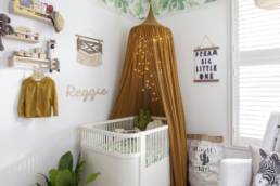
Bunkbed pods: The kids’ bedroom is just 2 x 2 metre but incredibly it is packed with storage, and they absolutely love it! Building your own bunkbeds incorporating draws underneath and filling the space you have entirely is the most effective way of creating the tiniest of bedrooms and I think it’s pretty cute too!
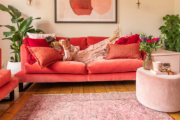
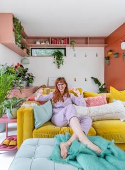
Sofa castors: This simple addition has transformed the way we can use our small space, especially with our kids! Not only was this a super easy thing to do (we bought castors online designed for this and with a hand drill the castors were fitted in 5 mins or so) but having an adaptable home in this way in the future if you ask me. It means we can move the sofa into 4 different locations which opened up the living room if we want to exercise, play or have a bunch of people working in the space! Also, we can wheel our sofa out onto the deck which is a lot of fun!
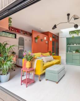
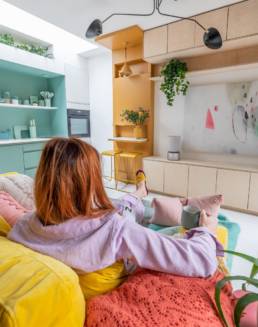
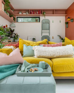
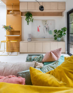
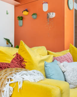
My Costello sofa was the inspiration for the entire design of my space. I find the best way to come up with a scheme is to start with one item and work from there adding in colours and textures as you go! So, I started with the sofa and kept adding colours that complimented the yellow. The Costello sofa is comfy, compact, and contemporary so it was a perfect choice. The Costello sofa has that perfect blend of contemporary and classic, its squarer arm suits my modern style over a more traditional rounded arm sofa which suits a more classic look. I am a huge lover of colour as you can see from my design, so as soon as I saw the bright yellow fabric, I knew that was the one.
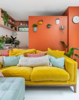
Much of my small home design success was down to DIY. I would say the single most important thing that helped us achieve the balance between practicality and style, was making all our furniture. When designing a small space, putting colour on walls is risky, really you want light white walls and ceilings to make the space look as large as possible (I love white walls anyway!) so I knew that I would need to add all my colour in soft furnishings and furniture.
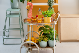
Aside from our amazing yellow velvet sofa, all other furniture in the space was designed by me and built from scratch. This just meant every last CM of space is used and everything in the space has multifunctional elements which could never have been achieved with off-the-shelf furniture. Once the furniture was built, I was able to add my colourful signature style using paint, again not something that could have been achieved by buying furniture.
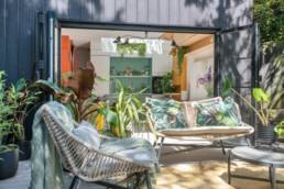
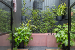
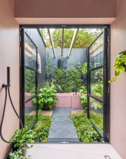
To maximise the feeling of space in #SheilaShed I focused heavily on indoor-outdoor interior design, blurring the lines between inside and out.
My advice on how to achieve this, is plants, plants, plants! Adding house plants to your home will instantly bring the outdoors in (plus is great for your air quality too!).
With this style, you are looking to bring in as much natural light as possible. We used roof lights, French and bi-fold doors front and back.
Size matter not – all it takes is a little bit of imagination!

