How to use colour in your home?
Of all the questions I get asked, the one that comes up the most is ‘How do I successfully choose and use my colour schemes?”.
And I get it, colour can be scary, overwhelming and picking multiple colours that go together can seem daunting if you haven’t done it before! So here’s where I share a little secret with you, I haven’t always known how to use colour! My home used to be grey on grey, in fact, my very first social media handle was actually called ‘The house that Grey built!’. Say what???!
So how did I learn to use colour???
So how did I go from a sea of grey, to the confident, ‘mad about colour’ Sofie you know (and hopefully love), today you ask?
It started in my first, large scale, renovation, an Edwardian semi in East London, it was 2016 when we bought it, and I hadn’t yet discovered my love of colour or had the confidence to use colour in my home.
So my journey with colour started how I would advise anyone new to colour to start….
Small!
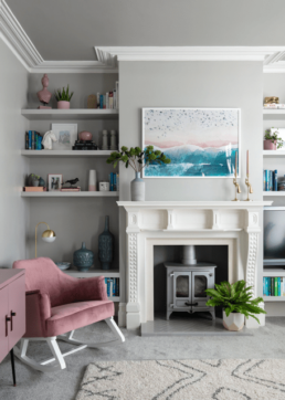
Starting with a grey canvas, which at the time felt safe and easy to work with, I started to experiment with adding small pops of colour into my soft furnishing and accessories.
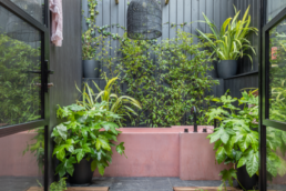
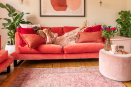
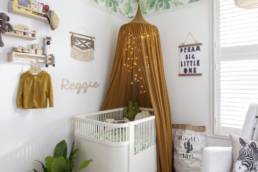
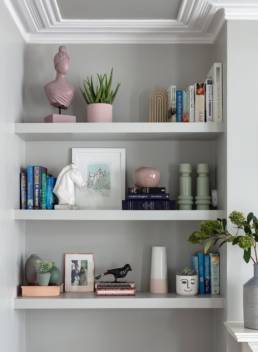
My alcove shelving was the perfect spot to slowly add pops of green, pink and blue that all work SO well against grey. And with colour being much like pringles ‘Once you pop you just can’t stop’ this is how my love for colour began, and slowly but surely, more colour started arriving in my home.
So my first top tip is to start small…
Adding pops in colour in your cushions, blankets, rugs, vases, plant pots and artwork is quick, easy and cost effective. This can also all be easily changed and is the perfect way to experiment with colour combos without making an expensive mistake!
My second top tip - Never decorate a room in isolation!
Ok so this is something that took me a little longer to learn and truly understand. I think it’s possibly the most common mistake people make in their homes when using colour (and I did it too!). There is a tendency for us to focus on one room (or even one colour or one corner) at a time, and this is when mistakes are made!
You need to think of your house as a whole! The colours in your home should work in isolation AND together. This will add flow and cohesion to your home. Think of your house as a sandwich, each element needs to work together to make it tasty!
After all, you can’t go slapping tuna in your peanut butter sandwich now can you?
So how do we go about picking the colours that go together for a whole house colour scheme? (which is exactly what I have done for my latest renovation).
I picked eight colours that form the basic/base of the whole house colour scheme and I will use them to then pick out everything else that’s going in the house. Paint cards are your friend! They’re going to do so much colour pairing for you. I always have one and take one everywhere with me. I have been using the Farrow & Ball so picking one that has the colours you love will work for this.
Colour cards have been created by experts. There is a lot of science behind them and they are in positions based on what paint is mixed into them. Therefore they are perfect if you are not yet confident in colour. You can order your free colour card from Farrow & Ball here.
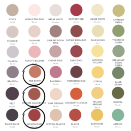
One of the colours I have picked was the beautiful red earth. If I wanted to add other shades of pinky red, I would go for the closest to it in the line. So, in this case, I am going to have red earth in a room, want a tonal deep feel to it so I would then go ahead and add Picture Gallery Red and the one at the bottom ‘Incarnadine’ and I would be looking for cushions and fabric in those two colours darker.
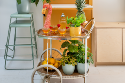
Then we get to the crazy bit. You want to go ahead and then pick two colours from a different family. Let’s say you want pink and green but don’t know how to match the colours that go.
Here is my red earth, the colours going across the paint card have the same undertones in them. Basically, a little bit of paint that is mixed in could be grey could be black, who knows. You don’t need to know all that. What you DO need to know is that the lines going across are going to help you match. So if you are looking for a yellow shade you’d go for the Citron one. The Cardroom Green would work wonderfully too. It’s helpful to fold over your colour card to see if they work.
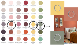
Sometimes they might be on the same line but unless they are next to each other you might not think they work but they do! The paint card isn’t just for paint so remember to take it out with you when you’re shopping for furnishings.
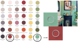
I have also paired the deep red ‘Incarnate’ with the ‘Arsenic’ blue shade which without the colour card I might not have spotted but the two work beautifully together and it’s a really interesting combination. This goes to show how these babies can really help you put togehter your colour scheme and inspire your choices.
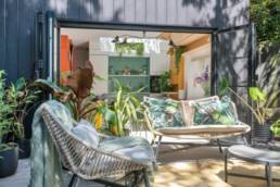
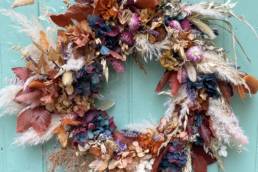
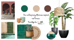
If you are looking for a more unusual combination, you shouldn’t be scared to think and look beyond the box. I have been going mad about mood boards. They’ve been super helpful when thinking about the colours and all the elements I want in the house. I have gone a little bit beyond my comfort zone specifically with one room…the roof terrace. I have gone for a contemporary Moroccan look with a deep teal, beige and deep dark red.
Should I avoid colour if I have a small space?
I have also paired the deep red ‘Incarnate’ with the ‘Arsenic’ blue shade. Without the colour card, I might not have spotted this combination. But the two work beautifully together. This goes to show how these babies can really help you put together your colour scheme and inspire your choices.
For more interior design and home decor inspirations, I have more blogs and tips in-store.