How to put together the perfect shelf – Shelfie Styling Tips!
How to style a picture-perfect shelf!
How to put together the perfect shelf…good question. In the whacky world of home decor and interiors, a shelfie is a much-loved feature. Huuuge on Pinterest and Instagram, shelfies are a harmonious display of all your trinkets in a clever and artistic way.
Shelfies have become increasingly popular in recent years, and they look great in any room. You can have one in the kitchen for displaying your stylish coffee sets, in the bathroom holding your perfumes and pampering essentials or in the living room stacked with books, photo frames and plants. By combining functionality and design, they have become key pieces in the decoration of any room. It’s also a rental-friendly way of adding interest to a room.
If you’re looking to put together the perfect Instagrammable shelfie, here are my tips…
___
Planning
This is the phase where you’re going to make some decisions. Determine your colour palette and style ahead of time so you have a clear vision when scoping out your pieces. When thinking about a colour scheme, you want to remember the rest of the room and tie in the colours together instead of clashing them. Keep it looking cohesive. If you’re not sure it is best to stick to white as your base colour. The same goes with the style of your shelfie, stick with the same aesthetic as the rest of the room.
Gather items in different heights to add variety and dimension. But remember to measure your unit in case you buy items that are too tall. Also, avoid buying too many small things as they can look cluttered. Make sure you can fill some of the vertical shelf space, it could look awks if all of your decor only fills the bottom half of the shelf.

Kitchen Shelfie
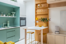
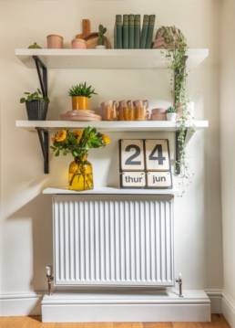
This shelfie was located in the kitchen. It was additionally used to slightly hide and distract the attention away from the bulky white radiator below. I used some colour-coordinated crockery which I kept in my favourite shades making them easy to mix and match with the rest of my decor.
Potted plants were added along with fresh flowers to add that botanical touch and to incorporate a bit of nature and green into my shelfie decor. My yellow glass vase went super well with the other yellow elements and as it’s quite quirky it looked very effective. The big calendar was a spontaneous touch and I think it added a fun but practical element to the shelf especially as this was one in the kitchen therefore it needed to be more useful.
Here are some features every shelf needs…
Vases – These look great in different materials and finishes and look super impressive. Why not go for glass, ceramic or metal vases in quirky shapes too. These can be used to display live or dried flowers but will also look great on their own.
Frames – Framed photos are where things get more personalised. Your favourite memories out on display in a stylish way can be a great way to accessorise a shelf. If you’re worried about colour schemes and clashing shades why not make the photos black and white and use a frame in a metallic colour.
Books – Books can be a bit tricky and can look messy if the spines are all different colours. You can always remove sleeves off of books and if the colours seriously clash you can flip them around so you only see the paper side.
Candles/Lanterns – There are so many candles and candle holders out there, in different shapes, sizes and styles. I tend to stay away from taller candle sticks and candles when it comes to shelf decor as these are usually too big to fit. Lanterns and filled candles work great and can smell amazing.
Plants – If you want to bring life to your shelves, add some plants! I often put a plant on every level (see my kitchen shelfie). It’s always better to use real plants but if you’re worried about forgetting about them and accidentally murdering your little green friends, opt for easy-to-look-after plants. You can’t go wrong with cacti but if you seriously lack a green finger or the shelf is in a difficult location for plants to thrive, a faux plant won’t hurt. But try and go for one that looks less plastic and shiny. Fresh flowers will breathe colour and life to your shelf too but if you don’t want to keep replacing them once they die, dried flower bouquets are a great alternative and will last forever.
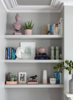
Living Room Shelfie
Sculptural Items – This is where you have to think about your style direction and pick sculptural objects that are aligned with that style. For example, if you are going for a coastal look, then coral and driftwood might be more what you are looking for while a modern shelf would look amazing with an abstract sculpture or item.
For this shelfie in my London home living room, I stuck to a pastel colour scheme to go with the rest of the decor. I used a few sculptural pieces that were both abstract and classic. I used mint green and pink elements and these went really well together.
It’s always good to add these pops of colour even if you are sticking to muted tones, no one said these have to be neon. With the frames, I stuck with white and metallic picture frames to not overwhelm the eye. I also used books to add different heights, this is a good technique if you find your shelf is looking a little flat.
Styling
This is the fun part! Assembling your items might take you some time, play around and try different things until it looks right. A useful design trick is to use the decorative triangle method. This is when you place three items with the goal of them visually connecting. Once everything is in place, you should be able to draw a line between the pieces and create a triangle. Visually, people like to see things in 3’s, or in odd numbers.
The triangle method guides the viewer’s eye, bouncing happily along the shelves. This is why when you don’t have that visual cohesiveness, the eye doesn’t know where to go and it gets peed off. The goal of this method is to make the shelf satisfying to look at from a visual point and not make you frustrated look at it even if it is on a subconscious level.
A good place to start is with the slightly larger or statement pieces. Once you dot them around it’s easier to group the smaller items. You can always start with your picture frames. Work out their placement first before putting photos in them. Start with 3 frames and place them in a triangle on the shelves. Then add your 3 plants and 3 metallic items. Once you have an assortment of things in place, you can layer in the rest.
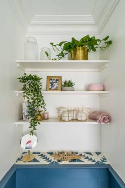
Bathroom Shelfie
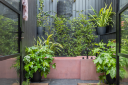
I kept this bathroom shelfie minimalistic and practical. By adding just a few bathroom-friendly plants I was able to elevate this shelf by making it more botanical. With the colour scheme, I kept it pretty neutral with gold and pink touches to go with the pink bathtub.
Some extra tips!
- There are so many different and impressive forms out there, you can always use candles as sculptural pieces too.
- Books, sculptures and vases are a great filler but can be expensive, to have more fun and to save money why not look for these in charity shops and vintage markets. Not only better for the planet but it means your pieces will be more unique too.

